Website Navigation and User Experience: Help Visitors Find the Right Service Faster
A UX and navigation guide for business websites covering menu structure, service grouping, internal links, mobile menu, search paths, CTAs and customer journeys.
Navigation should reduce thinking
Website visitors usually do not want to solve a puzzle. They want to find the right service, understand it and decide whether to contact the business. Good navigation reduces confusion. Poor navigation hides important pages, creates too many choices or uses labels customers do not understand.
Navigation design affects user experience, SEO and lead generation. If visitors cannot find the right page, they may leave before enquiring.
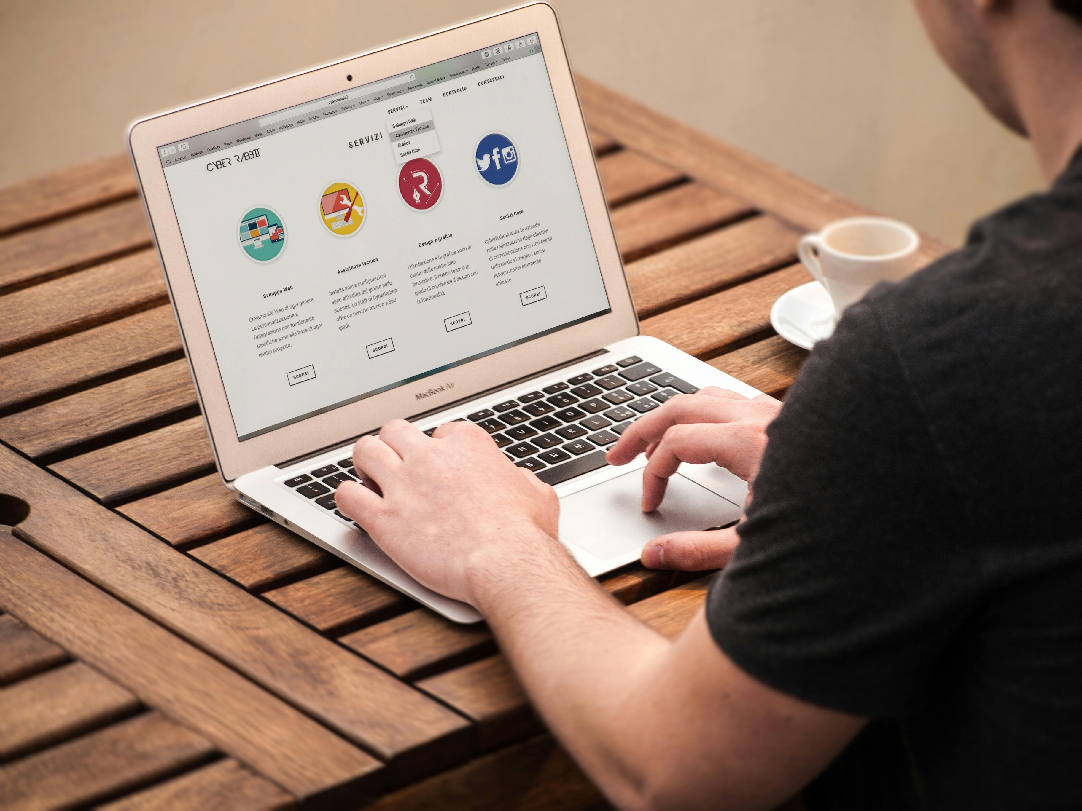
Use customer language in menu labels
Menu labels should be simple. Use words customers recognize: Services, Portfolio, Blog, About, Contact, Pricing or Tools where relevant. Avoid internal terms that only the business understands. If the menu item needs explanation, the label may be too unclear.
For service categories, group related services logically. A digital business can group Websites, Software, Marketing and Support. A salon can group Makeup, Hair, Beauty Services and Products. The structure should match how customers think.
| Navigation issue | Customer problem | Better approach |
|---|---|---|
| Too many menu items | Decision overload | Group services |
| Vague labels | Visitor confusion | Use simple words |
| Hidden contact | Hard to enquire | Visible CTA |
| Weak mobile menu | Users drop off | Tappable clean menu |
| No internal links | Dead-end pages | Guide to next step |
Design paths for different visitors
A first-time visitor may want to understand the business. A ready buyer may want a quote. A researcher may want blog content. A returning customer may want support or contact details. Navigation should support these different paths without making the header crowded.
Use homepage sections, service cards, footer links and internal links to guide visitors beyond the main menu.
Mobile menu quality
Mobile navigation should be clean and easy to tap. Avoid tiny links, menus that cover important content or hover-only interactions that do not work on phones. Important CTAs such as call, WhatsApp or quote request should remain accessible without feeling intrusive.
Internal links as navigation support
Internal links help visitors move naturally. A blog about website cost can link to website design services. A service page can link to portfolio or FAQs. A homepage service card can lead to the dedicated service page. These links should be helpful, not forced.
Businesses planning website structure, menu organization, service pages, UX improvements or lead paths can review implementation options at Indian Web Services services.
Footer navigation matters
Many visitors use the footer to confirm details. Include important links such as services, about, blog, contact, portfolio, policies and social links where relevant. The footer should not be cluttered, but it should support trust and navigation.
Navigation audit checklist
- Main services are easy to find.
- Menu labels are customer-friendly.
- Mobile menu works smoothly.
- Contact option is visible.
- Internal links guide next steps.
- Footer has important links.
- No important page is hidden.
- Navigation matches business priorities.
Final lesson
Good navigation makes the website feel easy. When visitors can find the right information quickly, they are more likely to trust the business and take action.
Design navigation from customer priorities
The menu should reflect what customers look for first, not how the company thinks internally. If customers often search for pricing, services, portfolio and contact, those paths should be easy. If a company has many services, use categories that make sense to visitors instead of showing a long list in the header.
A clean navigation system reduces support questions because visitors can find information without asking staff. It also improves SEO by making important pages easier to discover.
Mega menus and dropdowns need discipline
Dropdowns can help when a business has many services, but they can also become overwhelming. Group services into logical sections. Use short labels. Make hover or tap behavior reliable. On mobile, dropdowns should open smoothly and not trap the user.
| Menu type | Works well when | Risk |
|---|---|---|
| Simple menu | Few pages | May hide subservices |
| Dropdown | Medium service list | Can become cluttered |
| Mega menu | Many categories | Needs strong organization |
| Footer links | Secondary navigation | Can become messy |
| Sticky CTA | Lead-focused site | Can cover content |
User experience after the click
Navigation does not end when the user clicks a menu item. The page they land on must match the label. If the menu says “CRM Services,” the page should clearly explain CRM services. If the menu says “Portfolio,” visitors expect examples, not only a contact form.
Each click should reward the visitor with relevant information. This builds confidence and keeps the journey moving.
Use breadcrumbs or clear context where needed
For larger websites, breadcrumbs or clear page labels help visitors know where they are. This is useful for blogs, categories, tools, ecommerce and service directories. A visitor who understands the structure is less likely to feel lost.
User experience is often about small clarity improvements. The easier the website feels, the more professional the business appears.
Navigation should support sales staff too
A well-structured website helps sales staff send the right links to leads. If a customer asks about ecommerce, the salesperson should send the ecommerce service page. If a customer asks about examples, they should send portfolio. If a customer asks about process, they should send the relevant service or FAQ section.
This makes the website a sales support tool. Navigation is not only for anonymous visitors; it also helps the team guide conversations professionally.
What's Your Reaction?
 Like
0
Like
0
 Dislike
0
Dislike
0
 Love
0
Love
0
 Funny
0
Funny
0
 Wow
0
Wow
0
 Sad
0
Sad
0
 Angry
0
Angry
0


Comments (0)